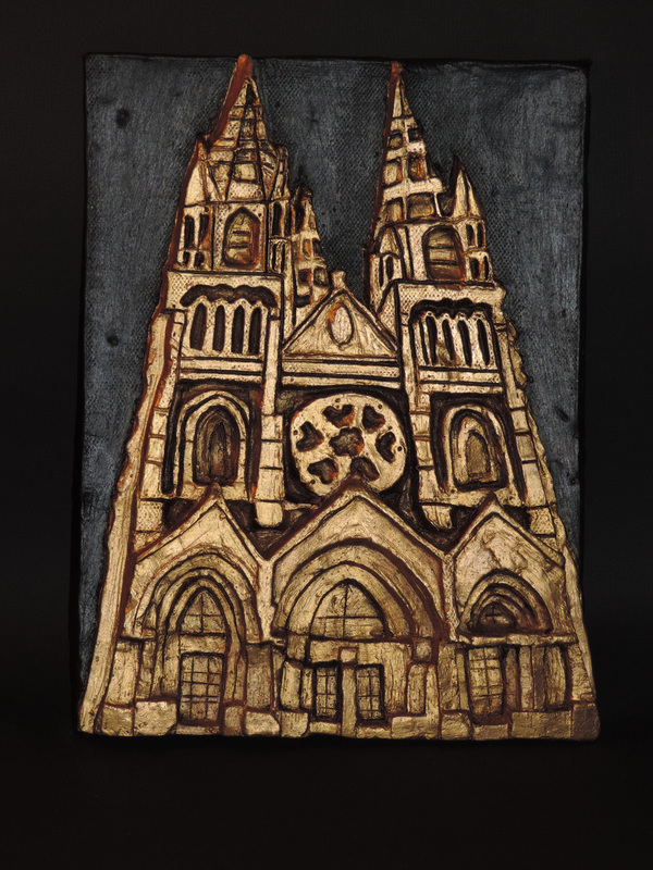
My favorite and most successful project this year is my architectural tile of the cathedral. Even though it took a long time and needed lots of detail, I think it came out the best. I like how the cathedral is gold with rub n’ buff and then the background is painted black. I personally think I grew the most from the value study we did using conte crayon at the beginning of the year. I did a skeleton foot, and I learned a lot from the different values within it using conte crayon. I think doing the conte crayon study helped with my charcoal drawing of the Boston Public Library, because I used a lot of white mixed with black to create value and depth within the architecture of the place, which I never really challenged myself with in such a way before that. I think any piece of my artwork that involves Boston reflects me as an artist because I identify with it, and it’s kind of a theme in my artwork. I enjoyed this course a lot, but I wish I spent more time on my concentration earlier in the year.
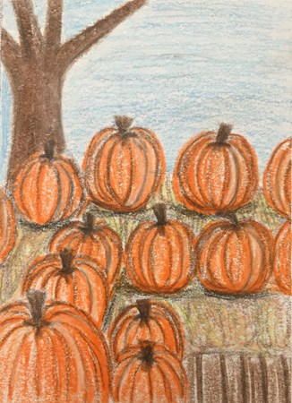
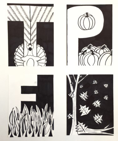 This was a small little project we all did that is not something we normally do. It's different from all the projects we usually have. Our goal was to practice positive and negative space. Each letter represents something different. First I have a T for turkey, a P for pumpkins, an F for fire, and an L for leaves. My goal was to make it fall themed.
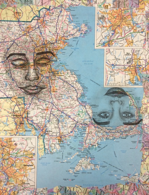
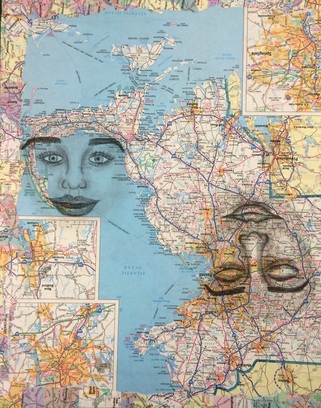
For this quarter one of art I want to include my summer assignments, the watercolor gradient, fracture and unity, and possibly the maps inspiration piece to my portfolio. Over the past nine weeks I have come out of my comfort zone and took risks with things I haven't tried before. Like trying conte crayon for the first, and not really planning things out as much as I used to and going with the flow. I really want to develop my own style this year and have a concentration and theme to my artwork.
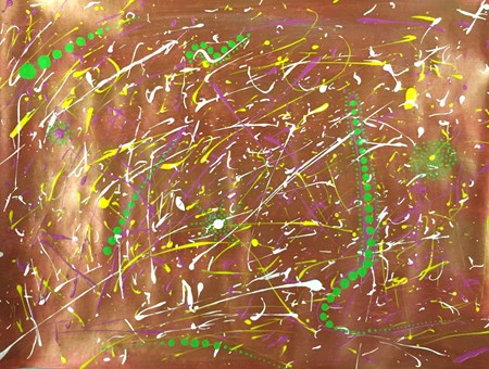
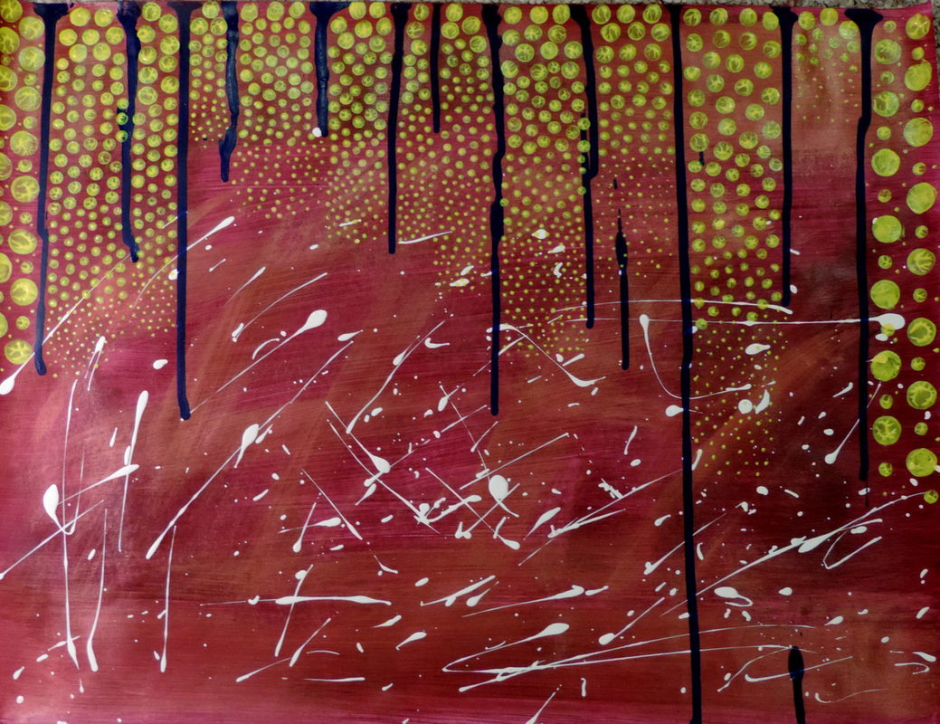
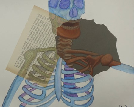 For this fracture/unity assignment I used three different papers. Charcoal paper, water color paper, and a ripped page out of an old book. I used conte crayon on the dark charcoal paper, blue and purple watercolor on the water color paper, and metallic colored pencils on the book page paper. My favorite part of the whole assignment is the conte crayon, I think it came out the best.
|
AuthorMillis senior AP art portfolio. Archives
May 2015
Categories |
 RSS Feed
